 |
Related Topics: |  |
 |
 |
|
 |
 |
 |
The Diagram Style window allows you to customize the appearance of the current diagram and all components within it and to set the default properties for new items added to the diagram. To access the Diagram Style window, choose Diagrams > Format & Style > Edit Diagram > Diagram Style.
The Diagram Style window consists of multiple pages that are accessible by clicking the page names in the navigation panel on the left side of the window.
You can save your settings in the Diagram Style window as a skin so that you can reuse them quickly and easily.
The Diagram pages allow you to customize the appearance of:
The diagram sheet (i.e., the background upon which blocks and other elements are placed).
Aspects of the appearance of diagram components (i.e., blocks and connectors) that cannot be configured at the individual component level.
This page allows you to customize the appearance of the diagram. You can specify:
Whether to display grid lines and, if so, the style of the lines (e.g., solid, dash, etc.).
The size of the grid squares, in inches.
The size and color of the shadow “cast” by blocks in the diagram. Note that this applies to all block types, but the shadow will be shown only if the Show Shadow check box is selected on the Defaults > General page for that block type.
The colors used for:
The background.
The grid line.
The page separator lines, which appear in the Print Layout view and indicate the boundaries of each printed page. You can display this view by choosing Home > Print > Print Layout.
Whether to display the block ID, which is an internal ID number assigned to each block when it is created. You can choose not to display the ID or to display it in decimal or hexadecimal format. If it is displayed, it will appear directly below the block name (i.e., its location, alignment and font will be dictated by the properties that are specified for the block caption).
This page allows you to customize the following properties of the connectors in the diagram:
Show Connectors Over Blocks if selected, any connectors that cross blocks will be shown over (i.e., in front of) those blocks. If not selected, the blocks will be displayed on top.
Where connectors attach to blocks if the blocks are not in direct horizontal or vertical alignment. If the Automatic Connection Preference field is set to Left-Right, the connector will attach to the sides of the blocks; if it is set to Top-Bottom, the connector will attach to the top and bottom of the blocks. If No Preference is chosen, the connector will attach to the closest edges.
The colors used for:
All connector handles.
Selected connectors.
Connectors to/from highlighted blocks (i.e., blocks that are part of a multiple selection).
Connectors leading to or from a selected block. This can be helpful in visualizing how a block is connected within a complex diagram.
The size of the arrow head, in inches.
This page allows you to customize the following properties of the blocks in the diagram:
The colors used for the handles that appear when you are:
Resizing a block.
Connecting blocks.
The size of block flags. Block flags are used to mark blocks that represent a data sheet that has been changed and has not been calculated or a data sheet that has since been deleted. These flags are not used by the software for analyses or simulations.
The style (e.g., solid, dash, etc.), color and thickness of the border for block flags.
The properties for a highlighted block, including:
The colors used for the caption, border and fill (i.e., the area background).
The fill style (i.e., how the color is applied to the area).
The Defaults pages allow you to customize the default appearance settings for diagram components (i.e., connectors, blocks and annotations). These settings are used for all new components added to the diagram and for all existing components that are set to use default settings in the Block Style window or the Connector Style window. There is a single page of default settings for connectors. For each block type, including annotations, there is a General page and an Image page.
This page allows you to specify the following default settings for the connectors in the diagram:
Line style (e.g., solid, dash, etc.), thickness and color.
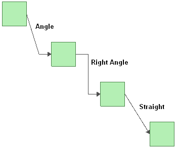
The kind of bend in the lines. If you select Angle or Right Angle, the Line Bend % field will be enabled. This field allows you to specify the point, in percent, at which the line will bend. For example, if you enter 50%, an angle (bend) will appear in the line at the horizontal halfway point. The available styles are shown next.
If you select Custom, you can click the connector and drag the selected point to create a bend in the line.
The location, text color and font used for captions on connectors. Captions are entered for each connector in the Connector Style window, which is accessed by selecting the connector and choosing Diagrams > Format & Style > Edit Connector > Connector Style or by double-clicking the connector. Possible locations include:
Auto: The software will place the caption where it fits best.
Middle: The caption will be as close to the middle of the connector as possible, depending on bends in the line.
Source: The caption will be displayed where the connector meets the source block.
Destination: The caption will be displayed where the connector meets the destination block.
Hidden: The caption will not be displayed.
Whether or not the arrow head is displayed.
This page allows you to customize the following properties for the block type:
The shape, background color, fill color and fill style used for the block type. The background color is the underlying color applied to the block; the fill color is applied over the background color in the pattern specified by the fill style. The options available in the Shape drop-down list depend on the block type. You can change the shape of standard blocks; node blocks, junction blocks and annotations have permanently assigned shapes.
The style (e.g., solid, dash, etc.), color and thickness of the block border.
How the block caption appears, including:
Location and Horizontal Alignment allow you to specify where the caption will be displayed (e.g., under the block, inside the block, etc.) and whether it will be left aligned, center aligned or right aligned. If you choose to place the caption to the left, right or inside the block, you can also specify the Vertical Alignment (i.e., at the top, center or bottom of the block). If you choose to hide the caption, the Alignment fields will not be available.
The color and font used for the text.
Whether or not a shadow is shown for the block.
The size of new blocks. Unlike the other options on this page, changes to this setting will apply only to blocks subsequently added to the diagram.
This page allows you to specify the image that is displayed on the block, if any.
Click the Load button to browse for the desired image file. Use the Position drop-down list to specify how the image will be placed on the block (e.g., stretched to fit inside the block’s current dimensions, aligned from the top left corner, etc.). Selecting the Transparency Mask Color check box allows you to choose a color that will be shown as transparent when the image is displayed on the block.
Click the Clear button to remove the loaded image and use no image at all.
© 1992-2013. ReliaSoft Corporation. ALL RIGHTS RESERVED.