![]()
![]()
| Related Topics: | ||

Weibull++ includes multiple plot types you can use to visualize the results of your life data analysis. You can create plots by choosing Life Data > Analysis > Plot or by clicking the icon on the Main page of the control panel.
![]()
The scaling, setup, exporting and confidence bounds settings are similar to the options available for all other Weibull++ plot sheets. To learn how to customize a plot, see Plot Setup.
Tip: Weibull++ includes two additional plots you could use across all types of data folios: the overlay plot, which allows you to compare different data sets or distributions; and the side-by-side plot, which allows you to display different plots of a single data set all in a single window for easy comparison.
The following is a description of the different types of plots that can be created in a Weibull++ standard folio:
The Probability plot shows the trend in the probability of failure over time. The plotting positions of the data points are determined by the failure/suspension times in the data set (x-axis) and their corresponding unreliability estimates (y-axis).
Note: Unlike the probability plots for other distributions, the y-axis in an exponential probability plot always indicates the reliability instead of the unreliability. This tradition arose from the time when probability plotting was performed "by hand." The exponential reliability model starts with R = 1 at T = 0 (or gamma). Thus, if the unreliability were plotted, the axis would start at Q = 1 - R = 0, which is not possible, given that the y-axis scale is logarithmic.
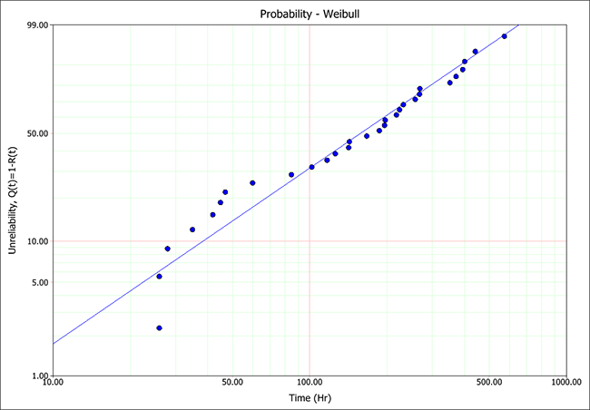
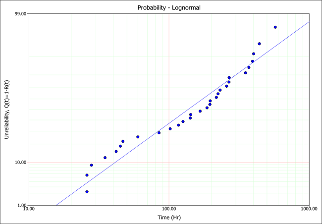
When the parameters have been calculated using rank regression analysis, the regression line is fitted to the data points on the plot in order to obtain the distribution parameters. Therefore, the plot can also be used to compare how different distributions fit a particular data set. The closer the regression line tracks the points on the plots, the better the fit.
In contrast, the maximum likelihood estimation (MLE) method obtains the solution of the line from the likelihood function, not by the plotting positions of the data points. Therefore, the line is not expected to track the points on the plot, and the plot should not be used to evaluate the fit of a distribution when using MLE.
The next figures show the rank regression analysis of single data set using a Weibull distribution and a lognormal distribution. As you can see, the probability plot shows that the Weibull distribution presents the better fit to this particular data set.
The Reliability vs. Time plot shows the reliability values over time, capturing trends in the product’s failure behavior.
The Unreliability vs. Time plot shows the probability of failure of the product over time.
The pdf plot shows the probability density function of the data over time, allowing you to visualize the distribution of the data set.
The Failure Rate vs. Time plot shows the failure rate function of the product over time.
The Contour Plot allows you to display a 3D surface on a 2D plot. The plot represents the 3D surface by plotting constant z slices, called contours, on a 2D format. Think of it as looking down at the 3D plot from above and the lines connecting the (x,y) coordinates are plotted at the position where a given z value occurs.
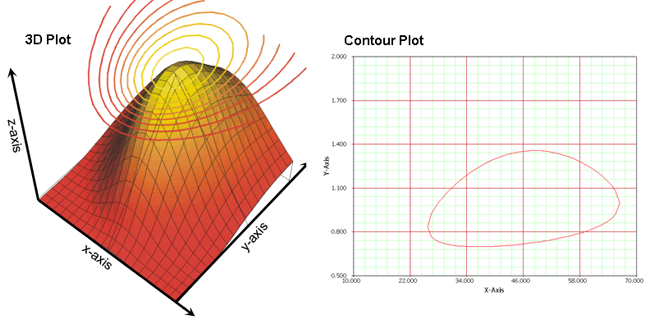
In Weibull++, contour plots are typically used to compare data sets. You can use the overlay plot feature to superimpose two contour plots from two different data sets at the same confidence level in order to determine the level at which the two data sets are statistically different. If the contour lines overlap, then the data sets do not show a statistically significant difference at that confidence level. See also Contour Plots.
The Failures/Suspensions Histogram is a bar chart that shows the number of failures/suspensions that fall into different time intervals. This allows you to evaluate the frequency distribution of the failures and suspensions in the data set. The chart has two display options:
Probability Density Values displays a chart where the height of each bar is proportional to the frequency of occurrence of failures in each interval. Select the Superimpose pdf check box to display the pdf line on the same chart.
Failures displays a chart where the height of each bar is proportional to the number of failures in each interval. Select the Show suspensions check box to display a bar chart of the number of suspensions in each interval.
You have the option to adjust the time intervals to get a good indication of how the data points are distributed. Note that if the histogram has intervals that are, in theory, infinitesimally small, the chart will result in a plot of the probability density function (pdf).
The Failures/Suspensions Pie chart displays the ratio and proportion of failures and suspensions to the whole data set.
The Failures/Suspensions Timeline plots are similar to horizontal bar charts. The values of the failures and suspensions are plotted on the y-axis and the time periods are on the x-axis. All the lines are anchored to the y-axis, giving a common point of measurement.
© 1992-2013. ReliaSoft Corporation. ALL RIGHTS RESERVED.