![]()
![]()
| Related Topics: | ||
![]()
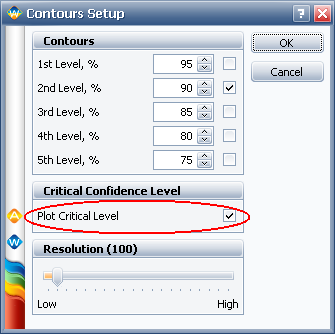
Contour Plots are available only for the 2- and 3-parameter Weibull, normal and lognormal distributions in Weibull++. The first time you select a Contour Plot from the Plot Type drop-down list, the Contours Setup window will appear. This window allows you to select the contour lines to be shown, the confidence levels represented by the lines and the resolution used to draw the lines.
For existing contour plots, you can access the Contours Setup window by clicking the Contours Setup link on the control panel of the plot sheet.
To change the level of detail at which the contours are plotted (and the smoothness of the lines), adjust the Resolution slider. You can click and drag the slider or, for fine adjustments, click the slider and then use the arrow keys. The number of points plotted to create the lines is displayed beside the field name. Note that higher resolutions will take longer to plot.
If an error in calculating the selected contour lines is encountered, the Contour Setup window will expand to include an error notification at the bottom of the window. In addition, the Contours Setup link on the plot sheet control panel will turn red.
In Weibull++, contour plots are typically used to compare data sets. For two contour plots that are superimposed in an overlay plot, the Plot Critical Level check box will be available, as shown next. This allows you to calculate and display the minimum confidence level at which the two contour plots intersect.
At any confidence level below the critical level, the contour plots will not overlap and there will be a statistically significant difference between the data sets at those levels.
The following example shows two contour plots in an overlay plot. The solid contour lines represent the 90% confidence level while the dashed contour lines represent the critical confidence level, which is calculated to be 94.243%. (The appearance of the lines in the example were modified via the Plot Setup to make the plot easier to interpret.) Note that due to the calculation resolution and plot precision, the contour lines at the calculated critical level may appear to overlap or have a gap.

© 1992-2013. ReliaSoft Corporation. ALL RIGHTS RESERVED.