![]()
![]()
| Related Topics: | ||

ALTA includes multiple plot types you can use to visualize the results of your accelerated life testing data analysis. You can create plots by choosing ALTA > Analysis > Plot or by clicking the icon on the Main page of the control panel.
![]()
Note that clicking the Plot icon before the parameters have been calculated will automatically calculate the parameters and then plot the data. The scaling, setup, exporting and confidence bounds settings are similar to the options available for all other plot sheets. See Plots.
Tip: ALTA includes two additional plots you could use across all types of data folios: the overlay plot, which allows you to compare different data sets; and the side-by-side plot, which allows you to simultaneously view multiple plots of one data set in a single window.
The following is a description of the different types of plots that can be created in an ALTA standard folio. Note that the use stress level for plots is by default the level you entered on the Main page of the control panel. However, you may adjust the level for plots by clicking Set Use Stress directly underneath the Analysis Summary area of the Plot page. This will not change the use stress level specified on the Main page.
The Use Level Probability plot shows the trend in the probability of failure over time at the specified use stress level. The plot also shows data points from the test that are transformed from the accelerated stress levels to the use stress level. The relationship between unreliability and time is linearized wherever possible, which results in non-linear axis scales. Like the standardized residuals plot, this plot is useful for comparing models that use the same life-stress relationship.
The Probability plot shows the probability of failure (i.e., unreliability) as a function of time at every stress level used in the test. The plot also displays the extrapolated line for unreliability at the specified use stress level.
Note: Unlike the probability plots for other distributions, the y-axis in an exponential probability plot always indicates the reliability instead of the unreliability. This tradition arose from the time when probability plotting was performed "by hand." The exponential reliability model starts with R = 1 at T = 0 (or gamma). Thus, if the unreliability were plotted, the axis would start at Q = 1 - R = 0, which is not possible, given that the y-axis scale is logarithmic.
The Reliability vs. Time plot shows the reliability values over time at the specified use stress level, capturing trends in the product’s failure behavior. The plot also shows data points from the test that are transformed from the accelerated stress level to the use stress level.
The Unreliability vs. Time plot shows the probability of failure of the product over time at the specified use stress level. Unlike the Use Level Probability plot, the axis scales are linear.
The pdf Plot shows the probability density function of data over time at the specified use stress level. This allows you to visualize the distribution of the data set.
The Failure Rate vs. Time plot shows the failure rate of the product over time at the specified use stress level.
The following plots show the relationship between stress level and another reliability metric. In multi-stress situations, one stress is varied and the remaining stresses are fixed. Click Set Use Stress on the Plot page of the control panel to select the varied stress.
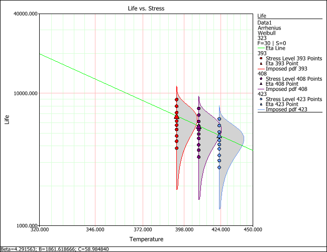
The Life vs. Stress plot shows the effect of a stress on the life of the product. Multiple pdfs, each at a different stress level used in the test, are displayed on the plot. The failure times obtained at each stress level are shown at the base of the associated pdf. Note that the lines and pdfs are mapped to the use stress level, but the failure times are plotted at the tested conditions.
If a model that uses the Weibull distribution is selected, an eta line will be displayed as well. The eta line estimates the time by which 63.2% of units in the population are expected to fail. The plot may also include other life lines that show the relationship between stress level and the time by which other specified percentages of a population are expected to fail. See Specifying Life Lines. The life-stress relationship is linearized whenever possible.
The Std vs. Stress plot shows the standard deviation of failure time as a function of stress level, thus providing information about the spread of data at every given stress level on the x-axis.
The AF vs. Stress plot shows the acceleration factor as a function of stress level. The acceleration factor is determined by dividing the product’s life under normal operating conditions by its life at an accelerated stress level. For example, if the acceleration factor is 2 at an accelerated stress level of 350 K, then the product’s life at 350 K is expected to be half of its life at the specified use stress level.
The following plots are residual plots. In these plots, a residual value for each data point is displayed. As a result, these plots are useful for assessing model assumptions, revealing inadequacies in the model and revealing any extreme observations. The ReliaWiki resource portal has more information on residual plots at: http://www.ReliaWiki.org/index.php/Accelerated_Life_Testing_and_ALTA#Residual_Plots.
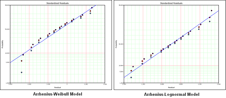
The Standardized Residuals plot is useful for determining the adequacy of the selected model for the data. The appropriate probability transformation is given on the y-axis and the values of the residuals are given on the x-axis. The residual values for each data point are color-coded to indicate which accelerated stress level the associated data point was obtained from. If the model adequately fits the data, the points should track the plot line.
For example, the next figures show the results of an Arrhenius-Weibull model and an Arrhenius-lognormal model using the same data set. As you can see, the plot shows that the lognormal distribution presents the better fit to this particular data set.
The Cox-Snell Residuals plot is similar to the standardized residuals plot, except the line is plotted on an exponential probability plotting paper and is on the positive domain.
The Standard vs. Fitted Value plot helps to detect behavior that isn’t modeled in the underlying relationship. It plots the standardized residuals versus the scale parameter of the underlying life distribution (which is a function of stress) on log-linear paper (linear on the y-axis). Note that when heavy censoring is present, the plot is more difficult to interpret.
© 1992-2013. ReliaSoft Corporation. ALL RIGHTS RESERVED.