![]()
![]()
To create a plot in a Weibull++ life data folio, choose Life Data > Analysis > Plot or click the icon on the Main page of the control panel.
![]()
Tip: You can add additional plot sheets to the folio by choosing Life Data > Folio Sheets > Insert Additional Plot. The additional sheets can function as overlay plots to display results from multiple data sheets in the current folio on a single plot.
The following is a description of the different types of plots that can be created in a Weibull++ life data folio. (For general information on working with plots, see Synthesis Plot Utilities.)
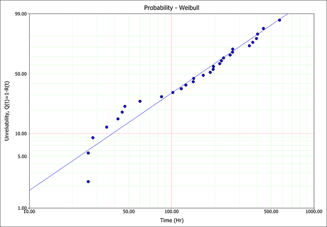
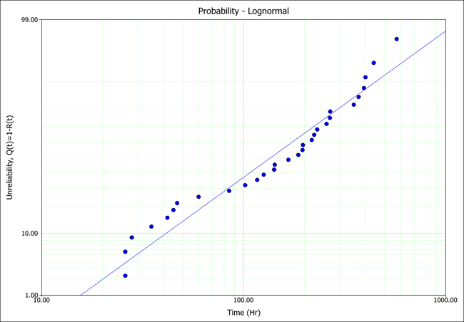
The Probability plot shows the trend in the probability of failure over time. The plotting positions of the data points are determined by the failure/suspension times in the data set (x-axis) and their corresponding unreliability estimates (y-axis).
Note: Unlike the probability plots for other distributions, the y-axis in an exponential probability plot always indicates the reliability instead of the unreliability. This tradition arose from the time when probability plotting was performed "by hand." The exponential reliability model starts with R = 1 at T = 0 (or gamma). Thus, if the unreliability were plotted, the axis would start at Q = 1 - R = 0, which is not possible, given that the y-axis scale is logarithmic.
When the parameters have been calculated using rank regression analysis, the regression line is fitted to the data points on the plot in order to obtain the distribution parameters. Therefore, the plot can also be used to compare how different distributions fit a particular data set. The closer the regression line tracks the points on the plots, the better the fit.
In contrast, the maximum likelihood estimation (MLE) method obtains the solution of the line from the likelihood function, not by the plotting positions of the data points. Therefore, the line is not expected to track the points on the plot, and the plot should not be used to evaluate the fit of a distribution when using MLE.
The following examples show the rank regression analysis of single data set using a Weibull distribution and a lognormal distribution. As you can see, the probability plot shows that the Weibull distribution presents the better fit to this particular data set.
The Reliability vs. Time plot shows the reliability values over time, capturing trends in the product’s failure behavior.
The Unreliability vs. Time plot shows the probability of failure of the product over time.
The pdf plot shows the probability density function of the data over time, allowing you to visualize the distribution of the data set.
The Failure Rate vs. Time plot shows the failure rate function of the product over time.
The Contour Plot shows a 3D surface on a 2D plot. The plot represents the 3D surface by plotting constant z slices, called contours, on a 2D format. The shape of a contour is determined by plotting the parameters of the data set (x- and y-axis) at the position where a given confidence level occurs (z-axis). In Weibull++, contour plots are typically used to compare data sets. (See Contour Plots.)
The Failures/Suspensions (F/S) Histogram is a bar chart that shows the number of failures/suspensions that fall into different time intervals. This allows you to evaluate the frequency distribution of the failures and suspensions in the data set. Use the Time Interval field in the control panel to define the length of the interval, then choose any of the following display options:
Probability Density Values displays a chart where the height of each bar is proportional to the frequency of occurrence of failures in each interval. Select the Superimpose pdf check box on the control panel to show the pdf line on the same chart.
Failures displays a chart where the height of each bar is proportional to the number of failures in each interval. Select the Show suspensions check box to show a bar chart of the number of suspensions in each interval.
The Failures/Suspensions Pie chart displays the ratio and proportion of failures and suspensions to the whole data set.
The Failures/Suspensions Timeline plot is similar to a horizontal bar chart. The values of the failures and suspensions are plotted on the y-axis and the time periods are on the x-axis. All the lines are anchored to the y-axis, giving a common point of measurement.
© 1992-2017. HBM Prenscia Inc. ALL RIGHTS RESERVED.
 |
E-mail Link |